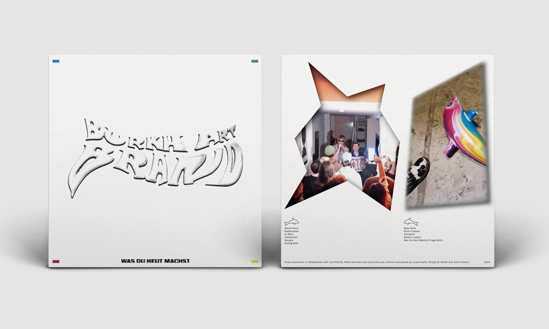
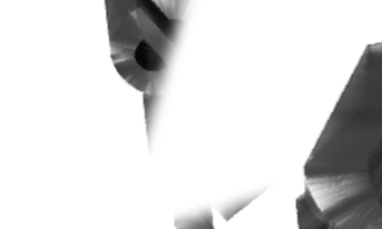
Burkhart Brand
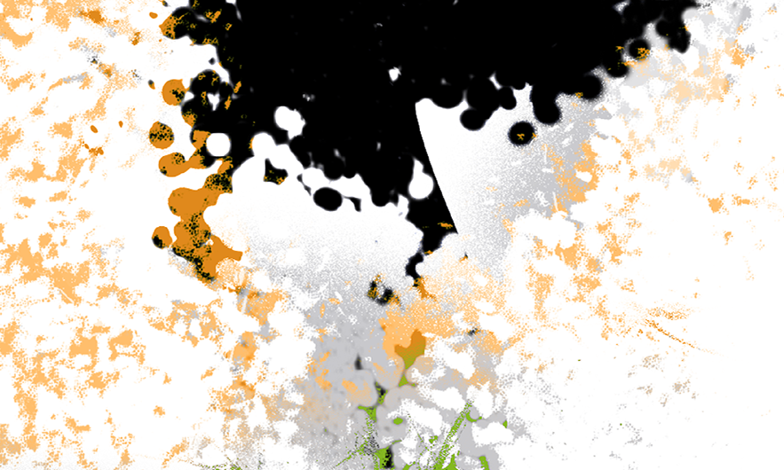
This artwork for BB's physical vinyl release "WAS DU HEUT MACHST" started with a logo design. Inspired by rough sketches, trippy aesthetics and "in the making"-styles, the band's logo is a screenshot from a type animation I created earlier for a music video of the band. The full artwork evolved in cooperation w/ Philipp W. Rösler
—Art Direction, Vinyl Artwork
Expanding Dreamscapes
In this project I led the overall art direction, took intense part in the creative and research process, worked out the layout of the exhibited artworks, developed the wall layout, designed several communication materials (posters, flyers, invitations, information sheets, surveys) and collaborated with the technological artist Roman Miletich creating a hybrid event in VRChat running parallel to the real life exhibition situated in the venue of Flutgraben e.V., Berlin. For more information find the exhibition text in the following:
"Stills on Acylic Glass: EXPANDING DREAMSCAPES is former fluid liveness from virtual reality hardening in stills on acrylic glass in the analog world. It’s the disconnection of shared experiences from hardware, the internet, electricity, servers and harddrives. On display: worlds built by strangers, temporarily inhabited by colleagues and guests donning avatars built by more strangers. Interviews, workshop sessions, theatre, preparations, explorative tours. Will these be the motifs our children will send us from their holidays?" Client: Katharina Haverich
—Art Direction, Exhibition Design, Graphic Design
Situation Magazine
"Based on the work of Studio SMS I redesigned and layouted the 002 issue of SITUATION MAGAZINE. Additionally I designed graphics to separate chapters and developed a matching gradient for the cover."
—Editorial Design, Digital Illustration
Das Metaversum zerstalten
"In this project I led the Art Direction and worked out the Editorial Design for an interdisciplinary anthology published in 'transcript' publishing house. The graphic concept followed an inclusive-oriented approach and payed special attention to image descriptions, information in plain english and the usage of a humanistic sans-serif font for text within the articles. Nevertheless, I have added disturbing elements that are irritating to read and demand special attention - functioning as a typographic metaphor for different needs and requirements."
—Editorial Design, Inclusive Graphic Design
Virtual Architects
"Virtual Architects is a transdisciplinary working group. It operates in the field between digitality, virtuality, diversity and cultural practice. I designed various project's visualities as well as the overall CI for the collective. www.virtual-architects.org. Client: YMUSIC GMBH x Katharina Haverich"
—Corporate Design, Web Design
Set the Stage
"Set the Stage explores current states of social virtual reality. The project concentrates on inclusive conditions of production and reception of culture in (the) metaverse. The approach is based on an artistic case study: a virtual theatre stage will be developed, designed, implemented and played in VRChat. Within this process, the project aims to practice and foster work in transdisciplinary and diverse teams. The project Set the Stage is located in the field of artistic production and reception of culture. For this purpose, a virtual theatre production serves as a vehicle to explore the digital worlds for inclusivity and diversity and to explore potentials. In this space—and already during its development—rehearsals of a play by Bertolt Brecht will be carried out. Brecht Into the Metaverse! Client: YMUSIC GMBH x Katharina Haverich"
—Art Direction, Graphic Design
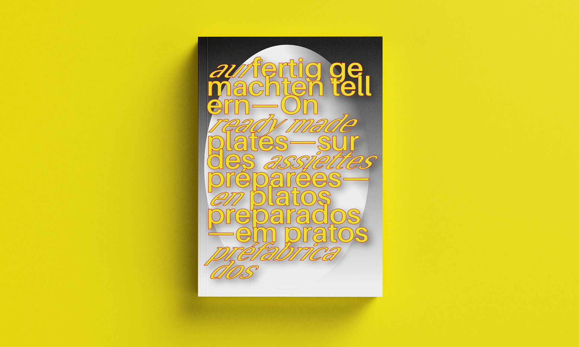
auf fertig gemachten tellern
"This book, the texts, the illustrations are part of observations. Found footage. Ready-made land art. The texts were written in German and then automatically translated into English, from English into French, from French into Spanish and from Spanish into Portuguese with all the errors that creep in on the way through these passages. Tear up the book in your mind. Give away a tear. The book will be given away at least twice each on a journey in 2024 in: DE, FRA, ESP, PRT, MAR. ‘Encounters are a matter of luck.’
—Editorial Design
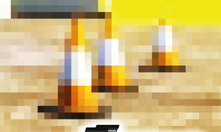
Puzzeln & Brettern Festival Stage
"For this project I worked with a festival stage crew and designed a hand lettering (UNTERTITEL IN GELB) for the stage. Additionally I added a minimalistic decor, by working with two colors and simple brush strokes to the crew's concept of a natural stage construction in half-timbered style. Building team: Elias Trabucchi, Clara Schlüter, Louis Weber, Tom Las Kohrs, Ludwig Kroll"
—Hand Lettering
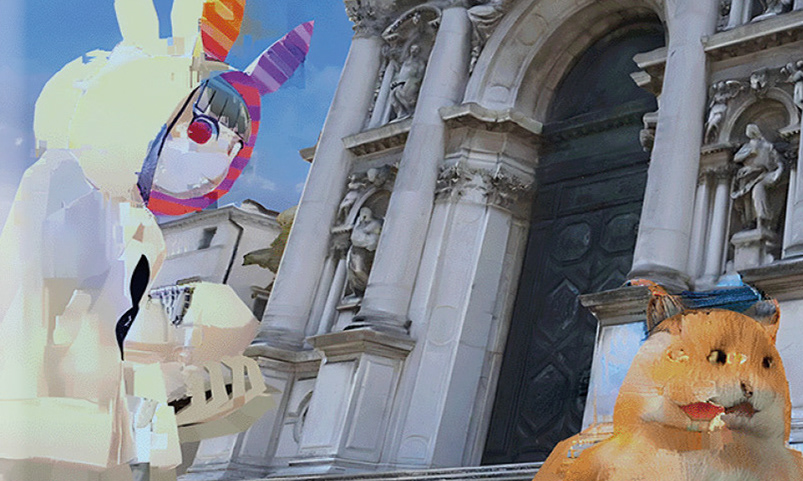
Postcards From The Metaverse
"Postkarten aus dem Metaversum" is a series of performative events (beginning in autumn 2022) by media artist Katharina Haverich. The series of lecture performances aim to share experiences of travelling in and through Virtual Reality (VRChat)—and bring these back to real life. For the project I directed the overall visuality and developed an event poster inspired by the style of travellogue events. For the lecture performances themselves I designed a series of analogue postcards inspired by the aesthetics of VRChat. For this purpose I processed VR stills taken by Katharina (partly shown in the exhibition Expanding Dreamcapes, 2022). Besides these stills the postcards display the name of the VRChat world, the name of the creator of the world and a short description about the situation the still has been taken in. The look and feel of the postcards connect to the familiar aesthetics of 'used" analog postcards while still retaining a certain digitality. Client: Katharina Haverich
—Art Direction, Graphic Design
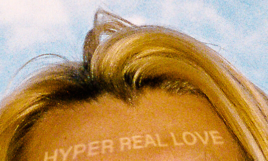
Hyper Real Love
Noah asked me to join forces with him and Felix Gerke to work on a concept on his hyper real love EP. I art directed the process, designed both a single and an album cover, a bunch of social media visuals and surprised him with a motion graphics lyric music video. Client: Noah Klein
—Art Direction, Cover Art, Motion Graphics
Various Album Artworks
—Art Direction
Boy
Together, Noah and I developed a concept for his music video 'Boy'. I directed and edited this short film and designed a title font. DOP and Color Correction: Anton Sieviert. 3D Artist: Felix Zechner. Actor: Simon Byrtus. Client: Noah Klein
—Art Direction, Titledesign, Editing
Umweltsoziologie TU Dortmund
In this project I developed a corporate design concept for a scientific department of the TU Dortmund: The department of "environmental sociology with a focus on transformation research" is affiliated to the faculty of social sciences. The task was to work out both a logo and a corporate design concept. Within the collaborative process a fluid key visual evolved that brings the opportunity of being adapted, scaled, shifted ... for the respective cause and area. The high-res graphic allows to choose certain (zoomed in) sections for any use. The logo structure is based on exisiting logos of other departments of the TU Dortmund while the added symbol contains various metaphors connected to the field of research.
—Corporate Design, Graphic Design
Newhork
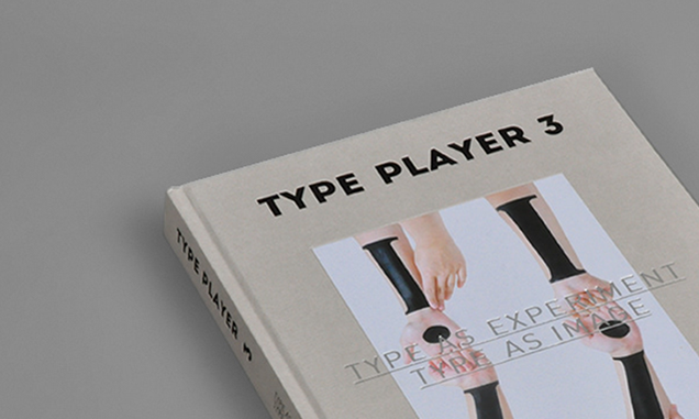
One of my Font Designs was picked by Sandu Publishing to be presented in their book Type Player II. The font is a grotesque typeface inspired by danish and finnish rune signs
—Type Design